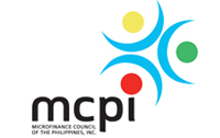
There is a Chinese proverb that says, “give a man a fish and you feed him for a day. Teach a man to fish and you feed him for a lifetime.” The wisdom in this saying is one of the messages symbolized in the former and new logos of the Microfinance Council of the Philippines Inc. (MCPI).

In the former logo, the five fishes right above their acronym represents the Council’s efforts in their assistance to the reduction of poverty through sustainable solutions such as microfinance. The logo also embodied 45 member institutions in carrying out their vision and mission as a “world class national network” in providing “financial or non-financial” assistance to alleviate poverty in the country. In the outer circle of the logo are the Council’s people linked together and are united by a common goal through their vision and mission. These men and women who come from many different sectors are MCPI’s stronghold. The brick wall in the background emphasizes that strong foundation.
Logo Refresh
However, last year, the Council has issued a resolution upon the agreement of its seven board trustees dated November 27, 2010 to update the existing logo. The work for the new logo proceeded after the members of the network gave their final approval. The proposed logo design is simple yet still maintains the Council’s strong message as stated in their vision and mission. The three-arm logo represents the three main islands of the Philippines: Luzon, Visayas and Mindanao.
The arms are facing out to symbolize “the openness and significance of MCPI’s resources to its member microfinance institutions.” The arms also create a circle that “signifies the holistic and collaborative approach of the organization’s mission of poverty reduction”. Though the color and design
may change and the fishes and the people are gone, the Chinese proverb still rings true to MCPI’s new look.
